The Cove
The visual redesign of the Care Program Approach Standards (CPA)
The Project outcomes
This project was run by NHS Lancashire Care Foundation Trust along side with an inpatient mental health unit called The Cove.
The brief
The brief demanded a visual redesign of the Care Program Approach standards (CPA). Along with side professionals and the inpatients themselves, we were to visually redesign the standards to be easily understood and remembered by all.
Context
A CPA meeting is a weekly meeting where each adolescent at The Cove has a meeting with every person that is involved in their treatment plan; this could include their parents or guardian, social workers, psychiatrists, brothers and sisters etc. Each service users CPA meeting is catered individually to each patient.
At the beginning of the project, it quickly became apparent that the visual representation of the CPA standards meant that neither the adolescents at the inpatient mental health unit nor the mental health professionals could consistently uphold the rules that were set out for each CPA meeting.
The Project breakdown
The project was broken into three sections:
Print based
The first was a print-based element to the visual representation. These were in the form of A1, A3 and A4 posters to be placed around The Cove as well as a welcome Brochure.
Non-verbal CPA cards
These non-verbal CPA cards were created to help the service user participate in their meeting in a non-verbal manner if they feel more comfortable doing so.
App/ website concept
Though this was a proof of concept, it helped The Cove see the potential in how the adolescents and their family could interact and understand the CPA standards in a digital format.
How were the service users involved?
As the primary user of these 10 CPA standards were the service users themselves, they needed to be involved as much as possible.
We were able to structure the design process over six sessions with the service users. The first was instilling into the service users head that there is no bad idea when brainstorming, that as long as you get your idea out in any format, you can see we are progressing. Initially, they were struggling to become creative with the CPA standards in their original format, so we broke down each standard into either a phrase or a single word.
This helped them focus on a single word and present what that single word for them. Initially, the aim was to create ten pieces of art that would represent the CPA standards. However, due to the health of the service users, it quickly became apparent that this would not be possible and that I would have to take influence from their work and create illustrations from them.
Below is the work created.
Print Based
This portion of the work was created to be able to be placed around the inpatient mental health centre as a constant reminder of the CPA standards and what they meant for not only them but what they were entitled to in the meetings.
Poster and Pamphlet
The CPA Poster
The poster was used as a constant visual reminder for all that are involved in the CPA meetings to be refreshed on what everyone must adhere to.
CPA Welcome Pamphlet
This pamphlet was created as part of a welcome introduction pack. The pamphlet held the initial key information on the CPA standards and what standard meant for service user.
Non-Verbal CPA cards
These non-verbal CPA cards were created to help the service user participate in their meeting in a non-verbal manner if they feel more comfortable doing so. Each card represented one CPA standard in a visual illustration based on the service users work with the corresponding side with the full description that standard.
CPA CARDS
01 Inclusion
Inclusion relates to some service users feeling that they do not have a voice when their health is being discussed in their meetings; this rule ensures that all service users have their voice.
It was important that the art was created by the service users, which represented them; each card was the CPA rule and corresponding illustration on the reverse side.
02 Individuality
Individuality card ensures that the service users are aware of what is going to be discussed in their meetings, this gives the service users prior warning so they can feel confident that they are in control of their own treatment.
03 Don’t Leave Me In The Dark
Don’t Leave Me In The dark card is to be used if any changes have been created without the service user being involved. However, this cannot always be possible due to a variety of reasons.
04 No Medical Jargon
No Medical Jargon relates to the issue of health professionals becoming too technical within the meetings, resulting in the service users becoming unable to follow their meeting and treatment plan.
05 Support
Support card is to be used if the service user feels they have not been made aware of service within the CPA process and within the meeting.
06 Paper And Pens
Paper and Pens card, although simple, is a crucial feature within feeling included in the CPA meetings if someone hasn’t even got the basics of a piece of paper and a pen how would they be able to be an active member within the session.
07 Breaking Down Barriers
Breaking Down Barriers card is to be used if the service user feels they are not being talked to directly and talked about when they are in the room. This to improve the feeling of being a whole part of their treatment.
08 Be Respectful
Be Respectful card is to be used if anyone taking part in the CPA meeting feels that they are not being respected. Appropriate actions are to be taken to ensure the session is concluded safely and respectfully.
09 Feedback
Feedback card to be used if no action plan is put in place after a meeting has concluded, this card can be discussed at any point after the meeting. This creates a plan so that the service user knows that there is a goal to aim for in each week.
10 Keep Me In The Loop
Keep Me In The Loop card is in place to ensure that even if the service user is unable to go to their meeting that they are updated in what was discussed, so they are included in every step of the way.
APP/ Website Concept
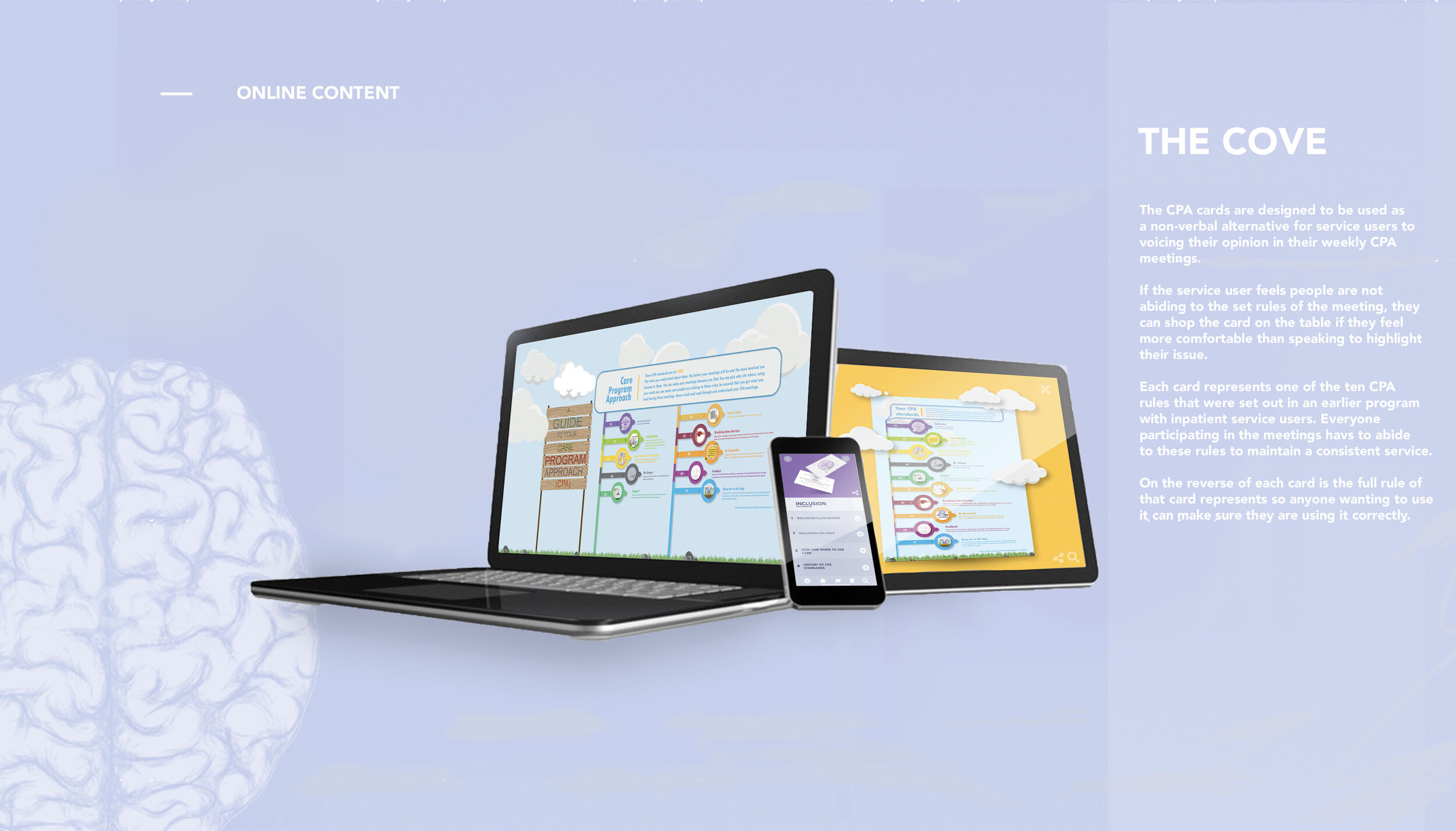
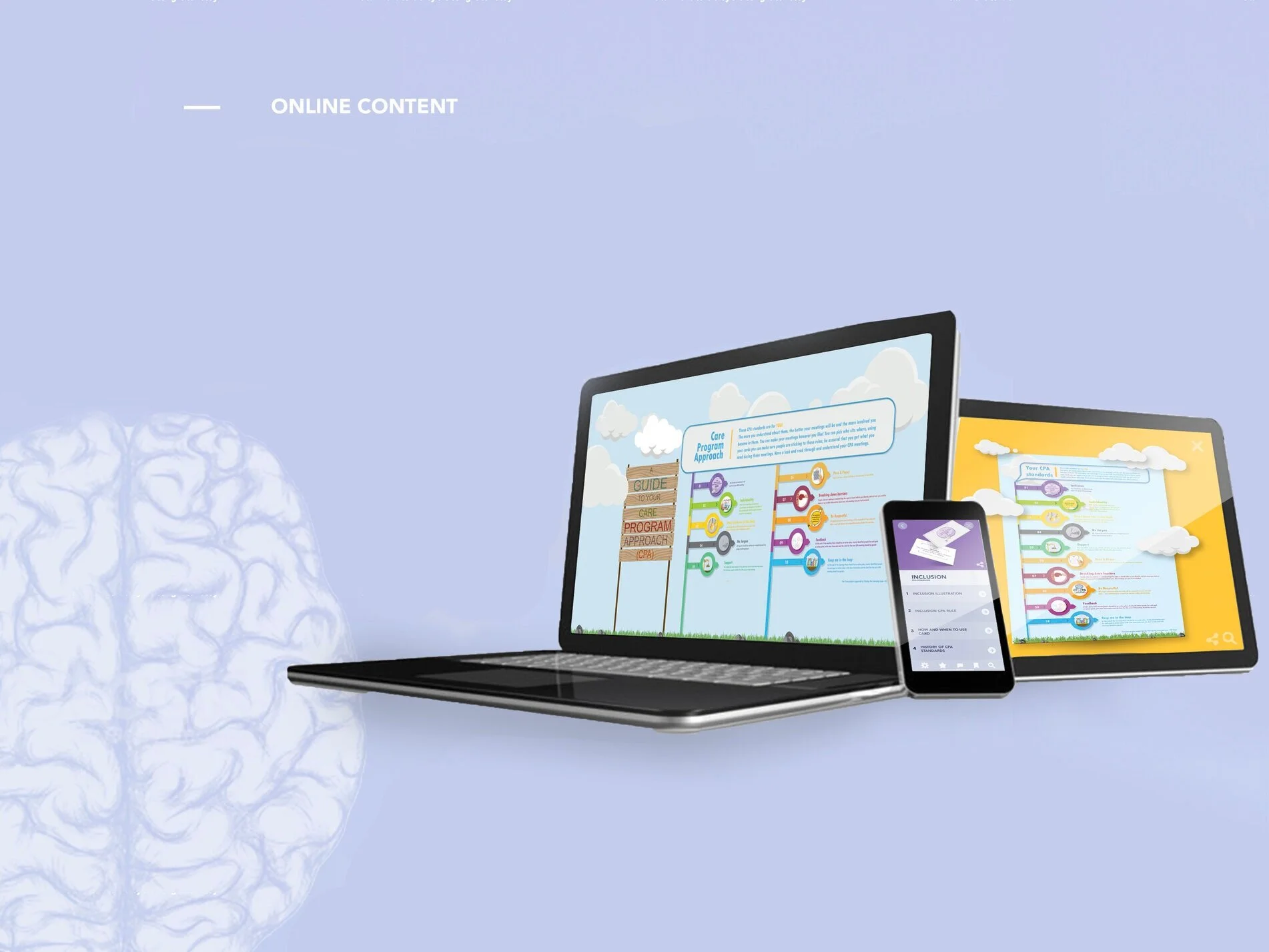
Though this was a proof of concept, it helped The Cove see the potential in how the adolescents and their family could interact and understand the CPA standards in a digital format. The idea of the app was for anyone to look through the CPA standards at their own time with and reducing cost for reprinting material.

Though this side of the package remained as a concept, it was essential to highlight the potential of the standards becoming more widely available to people outside The Cove. Allowing the parents and other professionals to be able to refresh themselves to keep consistency within the meetings.
Colour Variations depending on which CPA rule is selected
Keeping consistency with a range of colour palettes of each CPA standard. Each selected image will take the user to its section represented above. Each area will have its own corresponding colour palette to keep consistency throughout the package merging the digital and physical elements of the re-branding.
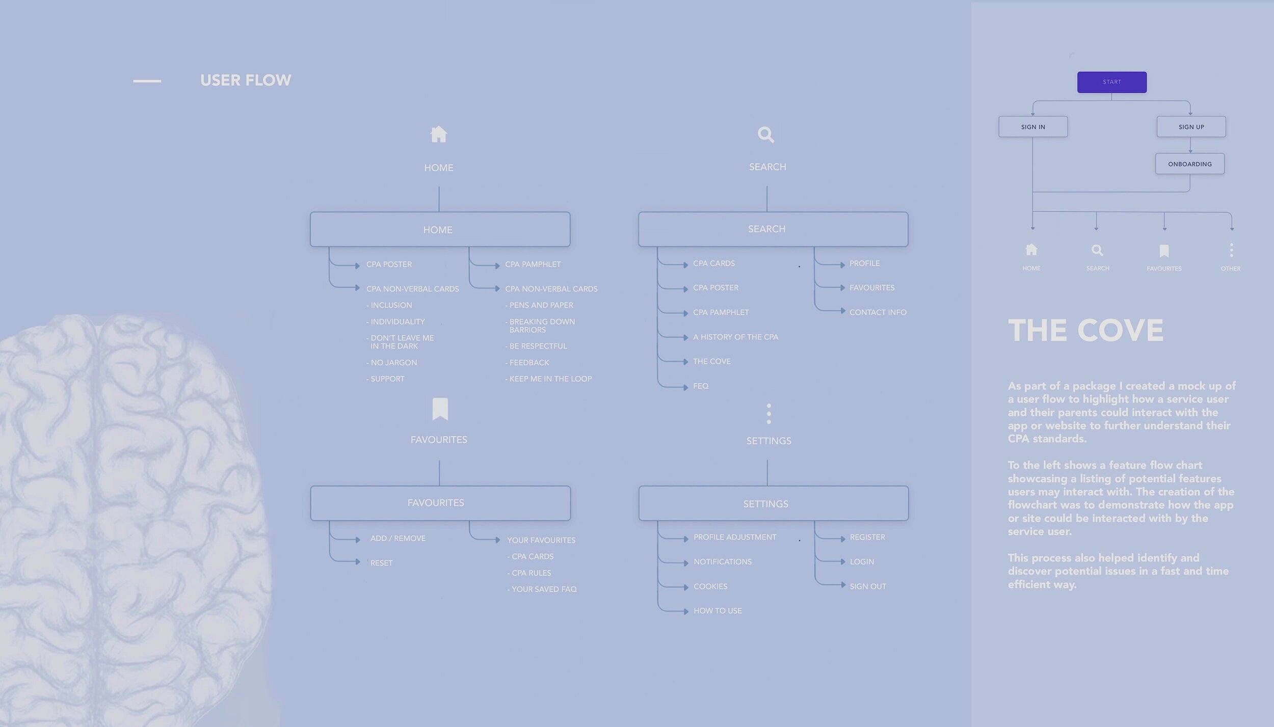
Above is the user flow that I created to showcase to The Cove how the service user or their family would interact with the app or website. These areas would be replicated for the remaining nine CPA standards, though this was not necessary at this point of the design process.
Though not overly crucial for The Cove to see. This was more for my benefit to set the colour palette for the home screen and icons that I will use throughout the app and website. If this element of the project were taken forward, I would have created these pages for all ten of the CPA standards non-verbal cards.
This user flow was created to demonstrate what each icon on the bottom of the screen would lead to; this includes further dropdowns. As this part of the project was not progressed; it only includes the app load up, home icon, search, favourites and settings.
UX concept
Overall, I enjoyed the process that I went through understanding and developing this concept. Though it wasn’t taken forward by The Cove, it helped demonstrate where the possibilities of getting the CPA rules more accessible to not only the service users but also to a broader range of users such as family members, outside professionals. The process taught me a lot about UX design, further sparking my interest in the area of website and app building; highlighting the importance of working through every aspect of the app, making sure that every element of the app is assessed and altered to the fit the users needs. Without considering the user throughout the design process, the project will always fail.
Return Home


